

Overlaying histograms with Seaborn in Python
A useful technique for comparing distributions of your data

In exploratory data analysis and data visualization, a good way to compare 2 continuous variables is to overlay their histograms. This can visualize the distributions’ shapes and show how they differ. The key is to make them translucent, so that you can see where they overlap.
Let’s simulate 2 datasets from the normal distribution to illustrate this technique. I ran the following Python code in Google Colab. Notice how I used
the random.normal() function within the NumPy package to simulate the data
Seaborn’s histplot() function to create the histograms
the alpha option to make them translucent
import numpy as np
import seaborn as sb
import matplotlib.pyplot as plt

# Create arrays x and y from normal distributions
x = np.random.normal(5, 1, 1000)
y = np.random.normal(9, 2, 1000)

plt.figure(figsize=(10, 6))

# Plot overlaid histograms
sb.histplot(x, color="skyblue", label="Normal(Mean=5, SD=1)", alpha=0.5, kde=False)
sb.histplot(y, color="salmon", label="Normal(Mean=9, SD=2)", alpha=0.5, kde=False)

plt.xlabel('Value')
plt.ylabel('Frequency')
plt.title('Histograms of Normal Distributions')
plt.legend(fontsize='small')
plt.show()
Here is the resulting plot.
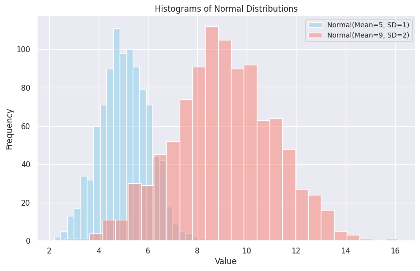
The two distributions overlap to some degree, but it is clear that Y has a higher mean and variance than X does. This observation can lead to further exploration - such as a test of significance about the difference in the two population means.
This is exactly what exploratory data analysis can do. It raises questions that lead to further exploration!