

Side-by-side box plots in Python
An example using matplotlib and the "iris" dataset

In statistics, data analysis, and data science, side-by-side box plots are useful for comparing distributions of continuous variables. Here is an easy example using the Seaborn package in Python.
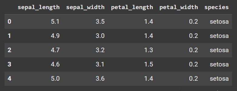
Seaborn has many built-in datasets that you can load within Python. I used the "iris" dataset in the following example. Here is the entire code to load and view a portion of the dataset.
import pandas as pd
import seaborn as sb
import matplotlib.pyplot as plt

# Load the "iris" dataset
iris = sb.load_dataset('iris')

display(iris.head())
Here are the first 5 rows of the dataset:
Here is the code for generating the side-by-side box plots:
# Create the box plots
boxplots = sb.catplot(x='species', y='sepal_length', data=iris, kind='box', hue='species')

# Label the axes
boxplots.set(xlabel='', ylabel='Sepal Length')

# Increase font size of axis and tick labels
boxplots.set_xticklabels(fontsize=12)
boxplots.set_yticklabels(fontsize=12)
boxplots.ax.set_ylabel('Sepal Length', fontsize=14)

# Capitalize the first letter of each tick label
tick_labels = [label.get_text().title() for label in boxplots.ax.get_xticklabels()]
boxplots.ax.set_xticklabels(tick_labels)

# Add title with indentation
title = 'Side-by-side box plots of\nsepal lengths for 3 iris flowers'
plt.title(title, fontsize=16)

plt.show()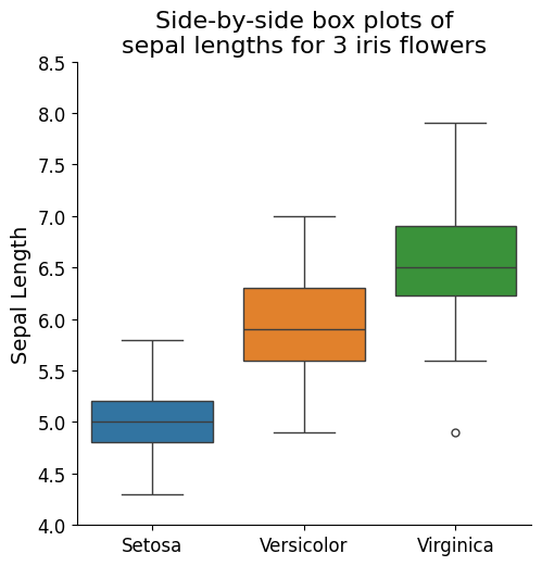
Notice that
kind='box'generates the boxplots.hue='species'generates the different colours for the 3 different species.I indented the title into 2 lines by writing “
\n” between the words “of” and “sepal”the original species names are entirely in lower-case. I wrote some code to capitalize the first letter of each species name.
I intentionally wrote
xlabel=''to remove the'species'label from the x-axis. This is my stylistic choice for this plot. I think that the tick labels of the individual species are sufficient and self-explanatory, but you can add'species'as the axis label if you wish.