

Using Seaborn for exploratory data analysis (EDA) of continuous variables
Creating histograms and scatter plots using the pairplot() function

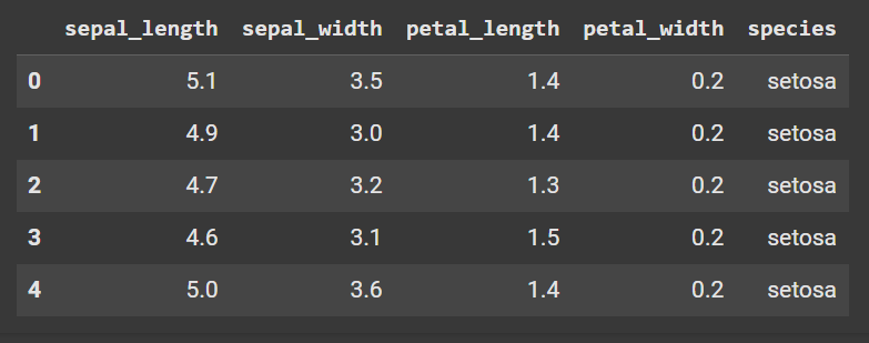
When you first analyze a dataset of continuous variables, I encourage you to start by creating a matrix of histograms and pairwise scatter plots. Let’s use the “Iris” dataset as an example; you can access it via the Seaborn package in Python. Here is the code to obtain the first 5 rows:
import pandas as pd
import numpy as np
import seaborn as sb

iris = sb.load_dataset('iris')
display(iris.head())
Here is what the output looks like in Google Colab:
Here is the code to produce the matrix of histograms and pairwise scatter plots for the 4 continuous variables:
import matplotlib.pyplot as plt
import seaborn as sb

iris = sb.load_dataset("iris")
correlation_plots = sb.pairplot(iris)
plt.show()
Here is the output:
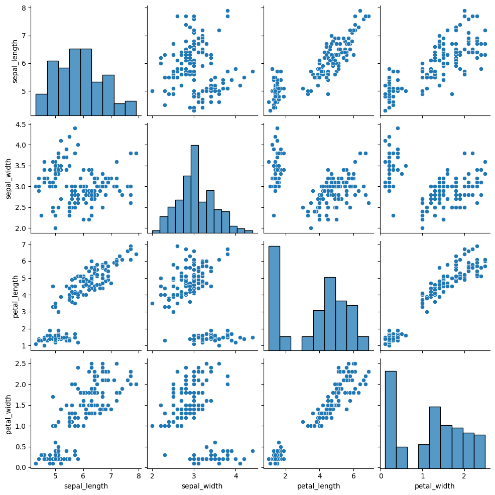
In the diagonal entries from top left to bottom right, you will find the histogram for each of the 4 continuous variables. They help you to understand the shape, spread, central tendency, and overall distribution of the data.
In the off-diagonal entries, you will find the scatter plot between each pair of continuous variables. This allows you to quickly assess the relationship between each pair of variables.
Using this information in your exploratory data analysis (EDA), you can move onto deeper analyses, such as correlation, regression, variable selection, outlier detection, and multicollinearity assessment.