


Exploratory data analysis (EDA) of continuous variables stratified by a categorical variable
An example using the "Seaborn" package in Python to analyze the "Iris" dataset

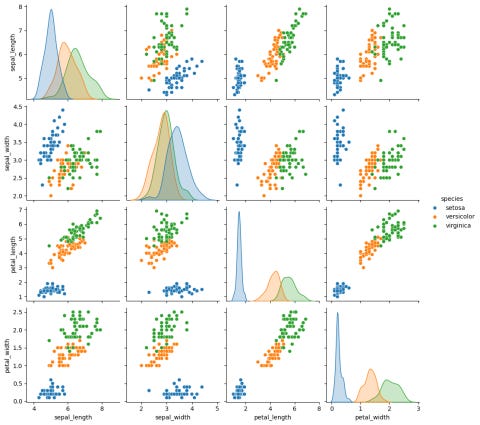
When performing exploratory data analysis of continuous variables, it is sometimes helpful to segment your analysis by a categorical variable. For example, the "Iris" dataset has 4 measurements for 3 species of flowers. You can create a matrix of kernel density plots and scatter plots that separates the data for each species. The “Seaborn” package can do this easily in Python; here is the code to do so.
import matplotlib.pyplot as plt
import seaborn as sb

iris = sb.load_dataset('iris')
correlation_plots = sb.pairplot(iris, hue='species')
plt.show()
I ran the above code in Google Colab, and here is the output. The 3 species (setosa, versicolor, and virginica) are denoted by the 3 different colours.
There is a key difference in the plots between analyzing the entire dataset versus analyzing by each species:
When analyzing the entire dataset, the pairplot() function shows histograms in the diagonal entries by default.
When analyzing by each species (as show in the image below), the pairplot() function shows kernel density plots in the diagonal entries by default. This is intentional, because it is easier to visualize the overlaying of multiple groups using kernel density plots than histograms. If you wish, you can change it back to histograms with the option “diag_kind="hist". Here is the documentation for the pairplot() function with more information.
If you are not familiar with how to create a matrix of histograms and pairwise scatter plots, I strongly encourage you to read my earlier article.